This is the third in a series of posts on Saint Gaudens’s Puritan, in Springfield, Massachusetts. Part 1 set out questions for you to consider when looking at the sculpture. Part 2 set out my answers to those questions, including first impressions of the sculpture and the objects included (the figure’s body, face, costume, and cane), and the effect of the statue’s original setting. My tentative theme at the end of that post (subject to revision in this one) was: “A grim, looming Puritan armed with staff and Bible strides inexorably toward the viewer.”
This post gives my comments on the attributes of the sculpture, a big-picture overview (including a detailed look at a contrasting sculpture), why we might disagree on our interpretations, and historical notes on the Puritan.
Attributes
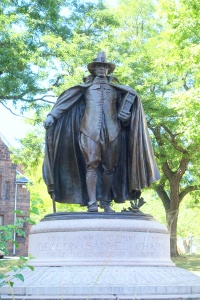
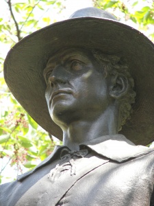
Can I add anything to my knowledge of the sculpture by looking at its attributes: its color, the use of light and shadow, the texture? The Puritan is bronze that’s been finished to dull brown with a green tint. This “patina” provides a protective covering for the metal as well as a distinctive appearance. Bronze finished to a high shine looks like gold or polished brass—very unpuritanical. The Puritan executed in white marble would have been dramatically brighter and hence less oppressive, even if the other details remained the same. The dark patina Saint Gaudens chose is somber—very fitting for a Puritan.
We’ve been contrasting the Puritan with Nathan Hale, by Frederick MacMonnies. Hale incorporates few heavy shadows. One of them is the space between the figure’s coat and body, which serves to emphasize how slender the body is. The large, deep shadows thrown by the Puritan’s hat and cape (unusual in a sculpture) emphasize the bulk of his body, and also contribute to the dark, somber mood.
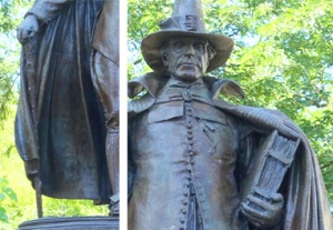
The most noticeable textures on this sculpture are around the staff and the Bible. The rough texture of the staff draws attention and makes it seem like a possible weapon, rather than an elegant accessory or a necessary support. The Bible’s ridged edges and clasps help set it off from the smoother surfaces of the vest and cape.
Previously I proposed for the sculpture’s theme or message, “A grim, looming Puritan armed with staff and Bible strides inexorably toward the viewer.” The darkness of the finish and the deep shadows suggest a dark mood, but that’s already implied by “grim” and “looming.”
Overview
To conclude my study of this sculpture, I step back from it to get an overview. At a distance, I notice that the body within the cape is a strong vertical. To say that this tells me the Puritan is “morally upright” may sound like word play, but I know that Saint Gaudens had many options for the pose—slouching, twisting, or bent with age, to name a few. “Upright” originally described a physical posture, and was transferred to moral stature. Here it is transferred back, and reinforced by the strong vertical lines of the cape’s folds and the line of the buttons. It is not much of a stretch to say that combined with his huge Bible and grim face, all these verticals remind us that the Puritan is, above all else, an upright man.
Stepping back also allows me to note that this sculpture is roughly symmetrical, in large part because the cape falls in approximately the same folds on both sides. That symmetry helps make the Puritan appear stable, solid, and unshakeable, even though he’s striding forward. And suddenly, seeing the Puritan again as a whole, I realize what the hat’s function is: its wide brim balances the cape’s width and helps draw the eye upward. Cover the hat with your hand as you look at the sculpture, and the head appears far too small in comparison to the rest of the figure.
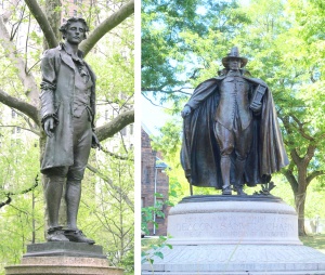
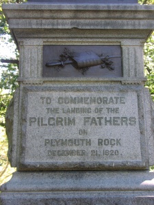
A detailed comparison of two sculptures of similar subjects often helps me notice details I missed. I decided to look at the Pilgrim by John Quincy Adams Ward, which stands in New York’s Central Park. Saint Gaudens’s Puritan was dedicated in 1886, Ward’s Pilgrim in 1885. Given the time it takes to design and cast a bronze sculpture, both were probably in progress at the same time.
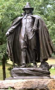
Ward’s Pilgrim stands upright and at ease, weight on his back foot. Since I have to shift weight to my forward foot in order to move, I know this Pilgrim is standing still. His coat is fitted above the waist, with slashed sleeves that would probably have seemed frivolous to the sort of man portrayed in Saint Gaudens’s Puritan. Moreover, the Pilgrim is armed for earthly battles: he grasps the muzzle of a musket in one hand and wears extra ammunition slung across his chest.
The wide-brimmed hat tops the unlined face of a young man gazing alertly into the distance. The face is more visible than the Puritan’s because although the Pilgrim wears a wide-brimmed hat, he does not have a high collar.
The Pilgrim’s setting is also very different from the original setting of Saint Gaudens’s Puritan. It stands on one of many small hills in Central Park, yards back from the sidewalk. I can stroll over to examine the statue or just walk on by. Hence, despite the musket, the Pilgrim seems less aggressive than the Puritan.
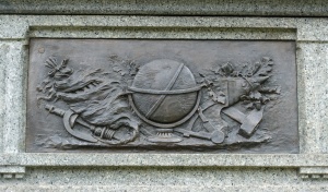
The reliefs on the Pilgrim’s pedestal also suggest that the figure has a different focus. On the front, a thick book labeled “Holy Bible” is closed over a sword. According to Reynolds, this symbolizes the sharp insights to be found in the Bible (Monuments and Masterpieces: Histories and Views of Public Sculpture in New York City, p. 66.).
The relief on the pedestal at the Pilgrim’s left incorporates a globe, a sextant for navigation, a hammer and anvil, and a spindle with yarn. This combination calls to mind commerce and trade.
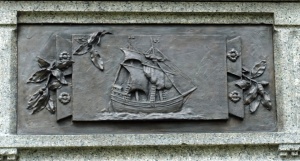
On the relief behind the Pilgrim, the Mayflower sweeps along with all sails set.
On the Pilgrim’s right, the relief shows a bow and a quiver of arrows.
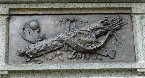
Together these four reliefs evoke not only religion but technology, commerce, travel, and martial courage. Ward’s Pilgrim is a wilderness settler and a trader as well as a religious man. Studying the Pilgrim has reminded me that Saint Gaudens had many choices when he created the Puritan. He did not have to portray a man who was first and foremost (or first and only) a militant Christian.
To summarize: Saint Gaudens’s subject is a Puritan, a man who came to America for the right to practice a certain religion in a certain way. As I noticed under “First Impressions,” the emphasis here is on the man’s breadth and towering height: he is not a figure to be easily circumvented. The mood is somber, even somewhat menacing. My final statement about the sculpture is, “A grim, looming Puritan armed with staff and Bible strides inexorably toward the viewer.”
But … but … but!!!
Let me close with a few comments on interpretation. After doing such a detailed study, is it possible for you and me to disagree on the artist’s theme in this work? Of course, but if our interpretations are based on observing the details of the sculpture, then we should be able to figure out why we disagree. You might say, “You didn’t take into account details X, Y, and Z.” I might say, “You’re putting too much emphasis on X, which is barely noticeable.” In other words, we should be able to pin down why our interpretations differ, and then discuss whether one of us is misinterpreting a particular element.
Also: in the Puritan, Saint Gaudens sculpted a man who takes religion very seriously and is willing to charge into battle (mental or physical) to make others believe as he does. Although I admire the Puritan as a work of art, I disapprove of the type of person represented by the Puritan. To the Puritans, the First Amendment’s statement that “Congress shall make no law respecting an establishment of religion, or prohibiting free exercise thereof” would have been anathema. From what I’ve read about Saint Gaudens and this statue, I don’t think Saint Gaudens had such a negative reaction to the Puritans. Is my reaction wrong because it doesn’t match the artist’s? No, because he and I are disagreeing not about the message of the sculpture, but about the values implied in this sculpture – in this case how religion ought to be practiced.
Part 3: Historical notes
Saint Gaudens was commissioned to create this work in 1883 by Chester W. Chapin, president of the Boston and Albany Railroad and a congressman. It was to be a portrait of Chapin’s ancestor Deacon Samuel Chapin, one of the three founders of Springfield, Massachusetts. Established in 1636, Springfield boasts of being the birthplace of Dr. Seuss, basketball, Smith & Wesson, and Indian Motorcycles.
No portrait of the deacon existed, which isn’t surprising since the Puritans would have considered having one’s portrait painted indisputable evidence of the sin of vanity. Saint Gaudens based the Puritan’s face on a portrait he had sculpted some years earlier of Chester W. Chapin. (I haven’t found an image of Saint Gaudens’s portrait of Chapin; Wikipedia has a photo of him.)
Saint Gaudens decided to work this into a broader image than an ancestor portrait: “I developed it into an embodiment, such as it is, of the ‘Puritan'” (Quoted in Greenthal et al., American Figurative Sculpture in the Museum of Fine Arts, Boston, p. 238). Odd as it seems given the prominence of the Puritans in the history of the American colonies and the United States, until the 1880s Americans had no standard image of a Puritan. Saint Gaudens asked the Chapin family to research seventeenth-century costume and sew outfits for his model to wear. Archival photographs of early sketches of the Puritan reveal that Saint Gaudens originally conceived a much gaudier costume and a younger, more slender figure for the Puritan. (The photographs are reproduced in John H. Dryfhout, Work of Augustus Saint-Gaudens, p. 165, figs. 125-4 and 125-5.)
Almost as soon as the work was unveiled in 1887, it became the accepted image of a Puritan, in both costume and attitude. Like Shakespeare’s most famous lines, many of Saint Gaudens’s works are difficult to appreciate today because they are so familiar. The Puritan looks just like we think a Puritan should: but it was Saint Gaudens’s sculpture that created the standard.
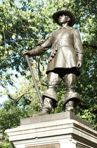
Philadelphia’s Pilgrim
Saint Gaudens reworked the Puritan to create a sculpture called the Pilgrim for Philadelphia. Dedicated in 1904, it incorporated minor changes in the pose and expression. The most notable difference was that the book was turned so the spine displayed, in large letters, the words “Holy Bible.”
Suggested readings
- Reminiscences of Augustus Saint-Gaudens, edited by Homer Saint-Gaudens. 2 vols. New York: Century, 1913; reprinted with introduction by H. Barbara Weinberg, New York: Garland, 1976.
- Wilkinson, Burke. The Life and Works of Augustus Saint Gaudens. New York: Dover; Gerrards Cross, England: C. Smythe, 1992.
- Dryfhout, John H. Work of Augustus Saint-Gaudens. Hanover and London: University Press of New England, 1982. The Puritan is item 125 (pp. 162-66, with numerous photographs); the Pilgrim is item 196 (p. 270).
- For more advice on looking at sculpture in detail, see Dianne Durante, Outdoor Monuments of Manhattan: A Historical Guide (New York University Press, 2007), which includes three more works by Saint Gaudens: Cooper, Farragut and Sherman.
- In Getting More Enjoyment from Sculpture You Love, I demonstrate a method for looking at sculptures in detail, in depth, and on your own. Learn to enjoy your favorite sculptures more, and find new favorites. Available on Amazon in print and Kindle formats. More here.
- Want wonderful art delivered weekly to your inbox? Check out my free Sunday Recommendations list and rewards for recurring support: details here.