Back in 1996 I started writing on how to look at paintings if you want to go beyond an initial emotional reaction. This is the opening of an unpublished paper on that topic that discussed eleven paintings at the National Gallery in London. (I’ve never been there, but at the time they had a guidebook with good color reproductions of reasonable size.) In 2007, I published an article on the topic in The Objective Standard, using paintings from the Frick Collection. That article is also available in Kindle format as How to Analyze and Appreciate Paintings, with the illustrations worked into the text.
Introduction
Suppose I show you a painting and say, “You have five minutes to identify the theme and justify your identification.” Is your reaction anxiety? discomfort? annoyance? Good for you: it should be at least one of the above. Leaping from the concretes of a painting to an abstraction such as its theme, without knowing the proper methodology for doing so, is bad epistemology. In fact, there’s a name for higher-level concepts that one can’t reduce back to concrete, perceptual knowledge: floating abstractions. Most Objectivists have scrupulously trained themselves to avoid floating abstractions. No wonder, then, that discussions of the visual arts make them uncomfortable. Little work has been done to standardize terminology or determine essential elements, never mind to set out a method for analysis and evaluation.
What we need is a way to proceed step by step from the concretes of a painting through a series of general statements to its abstract meaning. Then stating a theme will be a natural progression, not a leap of faith, and moving from there to an esthetic evaluation will be a logical step, not an emotional reaction. This paper aims to demonstrate the method for proceeding from a painting’s concretes to its theme.
What should we call this process? “Esthetic evaluation” is incorrect, since that requires judging the work of art as well as identifying its theme. Because this paper does not deal with evaluation, let us use the term “analysis,” in the sense given in Webster’s: “separation of the whole into its component parts,” or an “examination of a complex, its elements and their relations.”
I have assumed a basic knowledge of Ayn Rand’s writings on art, particularly her definition of art as “a selective re-creation of reality according to an artist’s metaphysical value-judgments.” Her works are cited throughout this paper, and the annotated bibliography at the end suggests further readings.
[NOTE: I’ve cut the section on why you’d bother to do such an analysis; see the introduction to Getting More Enjoyment from Art You Love in Kindle form or in The Objective Standard.]
How to analyze
If you are going to analyze, you must have an objective method for working through a painting: otherwise you will merely hurdle from one floating abstraction to the next. The method of analysis presented in the following pages is based on the fact that art is a selective re-creation of reality. Every concrete in a painting, from the smallest patch of color to the overall design, is there because the artist put it there to help fulfill his purpose. Leonard Peikoff sums it up this way:
Taking as the standard of selection his theme, [the artist] must weigh the need and implications of every item, major or minor, which he considers including in his work. He must regard and present the items he chooses not as isolated ends-in-themselves, but as attributes of an indivisible whole. This is the only way to achieve the kind of whole which is art, i.e., a slanted concrete, embodying, objectifying, flaunting a definite sense of life. – Leonard Peikoff, Objectivism: The Philosophy of Ayn Rand
We will therefore examine, systematically, what is shown in a painting and how it is shown: what each item is, and how it and its attributes work with the rest of the painting to form that “slanted concrete.”
In essence, the method is this. We look at particular aspects of a painting, describe them, and state what each implies about the subject of the painting, its mood and its emphasis. At certain points we combine these preliminary statements into a wider generalization (a tentative theme), and at the end, into a theme – a statement of the painting’s abstract meaning – that subsumes all the statements. Then we double-check the theme for accuracy against the statements made earlier, and, assuming that it’s broad enough to cover all of them, check also that it’s not too broad to be justifiable, given the painting’s concretes.
The bulk of the text [of this 1996 paper] consists of eleven commentaries on paintings from London’s National Gallery: four portraits, four narratives, two landscapes and a still-life. These commentaries are not polished art-critical essays. They are a series of notes to demonstrate the process by which you can explore a painting.
Will you agree with every one of my interpretations? Perhaps not. Rational men can disagree. What’s crucial is that at any given point while reading the commentaries, you should be able to say, “Yes, I see that,” or “I see that concrete, but disagree with your interpretation,” or “I disagree with your interpretation based on concretes X, Y and Z, which you have not taken into account.” You should not have to say, “Well, it just feels wrong to me” – you should be able to state clearly why your interpretation differs. …
The problem with induction
The process of analysis described here may at times seem disorganized and subjective, because there is no rigid formula for interpreting the concretes. I cannot tell you that if the dominant color is blue, the horizon is two-thirds of the way down the painting, and the human figures are half life-size, then the theme will inevitably be man’s helplessness in the face of nature.
There is a very sound reason for this. A painting is a collection of visual concretes. You must bring it into your conceptual grasp by discovering how its details relate to each other and work in the painting as a whole: by looking at the concretes separately and in their context. This involves the process of induction, of moving from the particular to the general rather than vice versa. Ayn Rand wrote:
The psycho-epistemological process of communication between an artist and a viewer or reader goes as follows: the artist starts with a broad abstraction which he has to concretize, to bring into reality by means of the appropriate particulars; the viewer perceives the particulars, integrates them and grasps the abstraction from which they came, thus completing the circle. Speaking metaphorically, the creative process resembles a process of deduction; the viewing process resembles a process of induction. — Ayn Rand, “Art and Sense of Life,” The Romantic Manifesto
But here’s the kicker: Induction Is Messy.
You search the painting for concretes and determine their relative significance. You consider it from another angle, note more concretes, and try to understand how they relate to those already observed. You integrate these into a more general statement of what the artist is trying to get across: a proposed theme. Then you loop back to see whether your proposed theme is consistent with all the concretes you have observed. At every step, you must consider the context you already know and be prepared to alter your conclusion if a new concrete demands it. This is not a simple process, nor a tidy one. It is, however, a very enjoyable exercise of your conceptual faculty, if you use a systematic method to look at the work of art, rather than flailing about haphazardly.
Analysis of Campin’s Portrait of a Woman

Orientation
Size of the painting: 40 x 27.9 cm. = 15.6 x 10.88″. She’s shown about half life-size.
Eye goes first to: woman’s face, especially her eyes
Subject
A portrait of a woman, from the waist up. The wimple covering her hair and the style of her dress date her to the late medieval or early Renaissance period; the jewelled ring on her left hand and the fur at her cuffs place her in the upper middle class.
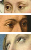
Human figure: The face is shown in three-quarter view (i.e., turned so that both eyes appear, both cheekbones, but only one ear), which displays the woman’s fine bone structure and healthy, unlined skin. She is young and beautiful, even with her hair and much of her body out of sight. Her eyes, focused to our left, set her mood as meditative – yet there is a lively glint in them, as contrasted with the flat, dull brown eyes of the sitter in Petrus Christus’ Portrait of a Young Man done slightly later. Campin’s sitter also seems aware of the world, even though we don’t know what she is looking at. Why? Because her eyes are wide open and focussed, rather than half-closed or rolled upward toward heaven, as in Raphael’s St Catherine of Alexandria.
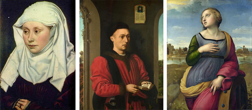
Can we make such a definite statement based on such a minor detail? Yes, because this is a painting, not a photograph. The artist had to make a conscious decision about the position of the woman’s eyelids, and we should assume that his selection is significant, unless we see a flagrant lack of integration in his work.
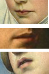
The mouth of this woman is decidedly sensual, wide and beautifully shaped, and is painted in a relatively strong shade of red. Note the intriguing shadows at the corners of the mouth on Campin’s portrait: it’s not clear, at first glance or after many glances, whether the mouth is set in a straight line, or whether it’s set in a faintly ironic smile, with the side on our left curved slightly up, the other side slightly down.
Tentative theme (1)
We could keep piling detail upon detail, but let’s pause instead for some unit reduction: a tentative statement of the theme. It doesn’t have to be exact, since we don’t yet have all the data, but we should blurt out what the painting is about and what the artist’s attitude is toward that subject. Then we’ll refine it as much as we can, and note any puzzling, unresolved issues.
Some portraits merely record the sitter’s physical appearance. The best portraits, however, capture something of the sitter’s character, and the character – shown by the expression, the pose, the details that are represented and emphasized – becomes the theme of the painting.
What do we know so far about this woman? She is young and beautiful. She has a steady glance directed at this world, and a sensual, intriguing mouth. She appears serene (the hands, the calm expression) but probably has hidden depths: while she is clearly thinking of something, she is not sharing it with the viewer by direct eye contact.
Note that these are the characteristics that the painter has chosen to show. Whether they accurately reflect the character of the woman who sat for the portrait is another question entirely – one that’s outside the scope of this paper and (given that the woman is unidentified, and has been dead for nearly 600 years) unanswerable.
On Saturday: the rest of the analysis.
More
- For Portrait of a Woman and other paintings by Robert Campin, see Wikiart.
- A zoomable image of Petrus Christus, Portrait of a Young Man, 1450-1460, is on FineArtAmerica.
- On Raphael’s St. Catherine of Alexandria, see Wikipedia.
- Want wonderful art delivered weekly to your inbox? Check out my free Sunday Recommendations list and rewards for recurring support: details here.